Love Unity Values Institute
Redesign for a non-profit organization
Project Overview
For Love Unity & Values Institute (LUV)’s website audit project, they sought a comprehensive feedback on user functionality, visual design, and content to achieve their goals through an optimized and effective online platform. I focused on enhancing user-friendliness by optimizing information hierarchy, refining navigation, refreshing branding and photos.
Encourage donations by making it easy for users to find and contribute
Ensure convenient access to comprehensible information on the programs
Revise and enhance the branding for a fresh, updated look
Business Goals
User research report, usability testing, site map, information architecture, task and user flows, visual redesign, style guide, prototype
Deliverables
Roles
UI/UX Designer, UX Researcher
Challenge
Establish an inviting platform that effectively communicates LUV's mission and objectives. Develop user-friendly navigation to instill confidence in potential donors as they browse the website to make contributions. Enhance accessibility for both youth seeking information about the programs.
Constraint: Consider solutions that can be implemented using the stakeholder’s website builder and user-friendly for independent modifications.
Homepage (existing)
Research
Evaluating the Existing Website
I conducted a usability testing then moved on questions to gain insights into users' needs when making a donation on a website. I developed a survey aimed at finding solutions to enhance the website's effectiveness in engaging and retaining supporters.
Five participants who had never visited the website were assigned tasks and were asked questions regarding the homepage, programs, and donation page.
Objectives:
Assess comprehension of the organization's mission
Identify challenges in navigation and interaction
Capture their initial perceptions of the branding
In my usability hypothesis, at least half of users will need time to grasp the organization's mission on the homepage. They will struggle to differentiate program offerings, potentially getting lost and not reaching registration. While users may manage to find the donation page, there may be disruptions in the flow due to navigation issues and insufficient fund allocation information.
Conducting Usability Testing
Testing Results
Problems:
Program information is dispersed across multiple pages, resulting in comprehension challenges and complicating the user’s journey
The overload of textual content overwhelms users making it challenging to focus on specific details
It is unclear how many programs are offered and difficult to differentiate them from the training and certifications
Survey Findings
I aimed to inquire users about their motivation and goals for supporting nonprofit organizations, as well as to gain a deeper understanding of their experiences when interacting with nonprofit websites.
Problem:
It wasn't a quick read for users, as they had to make an effort to read through the different ways to give to the organization
Define & Ideate
Building Empathy
The stakeholder communicated challenges faced by their current users. I organized the users' needs and pain points to facilitate the achievement of their goals and ensure satisfaction. I restructured the site architecture to address navigation concerns identified during usability testing. The objective was to create a convenient and straightforward task flow for finding programs.
Youth, typically 11-24 years old, benefit from LUV’s programs to not only prepare them for school and their careers, but also build critical thinking, communication, and leadership skills.
Donors support and provide monetary contributions include agency partners, corporations, foundations, schools, parents, and community members. From user information provided by LUV, I created personas to represent their main users.
User Insights
Daniel Simon (Youth)
Motivation navigate the path to success to work towards personal and academic achievement
Goal is to receive guidance in navigating his path to success via a program
Pain points include challenges in accessing and comprehending the information required for program registration
“I feel behind and frustrated with myself. I want to be equipped and empowered to act like the person I know I can be. I just need the right kind of help.”
Ivy Jacobs (Donor)
“I want to know that my hard earned dollars are going to an organization that is aligned with my values.”
Motivation empower the younger generation by providing transparency and clarity on the targeted impact of their contributions
Goal is to support the younger generation who need resources to further their education and careers
Pain point is that she would like to know where her contributions are directed
Restructured the site's architecture to enhance navigation after users expressed confusion regarding:
The number of programs available
Difficulty in returning to previously viewed pages
An overload of irrelevant content
By incorporating subpages within the main categories in the navigation bar, I aimed to provide users with a more intuitive and user-friendly experience, ensuring they can easily find the information they need without feeling disoriented.
Site Architecture
Improve on having options readily accessible on the homepage and/or navigation bar:
Programs are all displayed, along with individual subpages providing details for each program
'Ways to Give' displays the different options of support other than money
Donate button for quick, straight forward donations
Addresses the problem of users navigating from page to page in search of information, only to become disoriented. Streamlining the flow and minimizing confusion is crucial to prevent user frustration and reduce the likelihood of discouragement or abandonment.
Task Ahead! Stay on Course
Register for a Program
Give a Monetary Donation
This flow illustrates the path a user, a student, would take to register for a program. They can view one or all programs from the homepage or access them from the navigation bar.
User Flow, Finding Programs
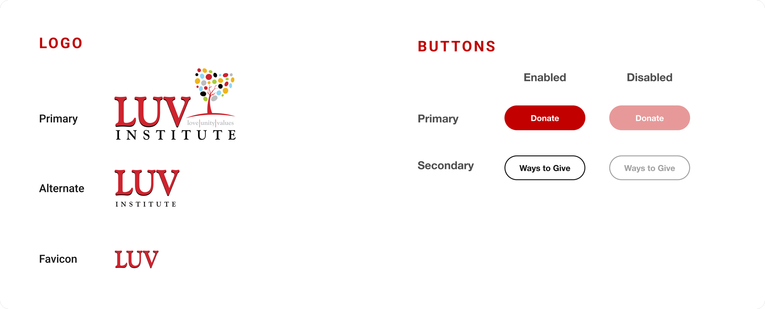
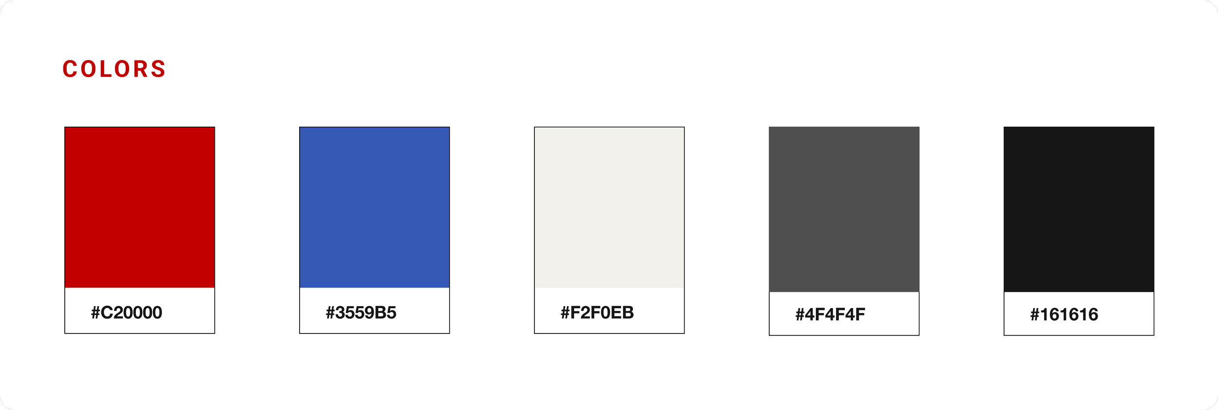
The stakeholder requested that their logo remained unchanged, retain the red color while incoporating the blue from their color palette. Keeping those considerations in mind, along with the users' impressions, I made adjustments to align with LUV's branding for a more welcoming look.:
Incorporating less red to convey strength and passion instead of aggression
Introducing blue from their original color palette to inspire trust and responsibility
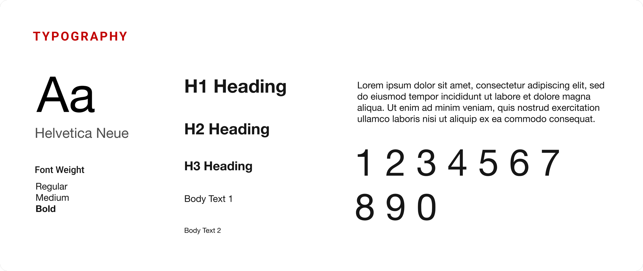
I opted for Helvetica for improved readability
Selected high-quality images to better encapsulate their culture, adding a humanistic touch to the website's design
I kept their original logo and provided variations for appropriate use
Brand Renovation
Reimagining the Key Pages
Throughout the usability testing, readability issues and a lack of information architecture organization were identified. Users expressed that the inconsistent design elements made it challenging to absorb information, and the overall presentation lacked a professional feel.
Solutions: Improved comprehension of organization’s goals by using clear images and rewriting copy, enhanced readability using a legible font, text remained in the same position on the slider, the CTA and secondary button feature distinctive styles, used the red color with intention as an accent
Solutions:
Program offerings can be found on the homepage and also on the navigation bar, making it easier to locate and access
Enhanced the user experience by organizing programs into cards providing a visually intuitive browsing experience, making it easier for users to browse through the available options and select the ones that interest them
Designed individual pages for each program to ensure users can easily access the relevant information without confusion
Solution:
Enhanced the user experience by organizing ways to give into cards providing a visually intuitive browsing experience, making it easier for users to browse through the available options and select the ones that interest them
Prototype & Testing
Gathering User Feedback
Conducted a usability testing using the prototype with the same 5 participants who took part in the initial usability testing of LUV's existing website. Evaluated whether the issues have been addressed and identified any additional areas that required improvement.
Objectives
Users mentioned that the redesign significantly reduced confusion and appreciated the cards for providing an overview of all available programs, which was previously unclear. They also expressed satisfaction with the individual pages for each program, finding the new flow conducive to task completion and boosting their confidence.
Additionally, users noted that the branding refresh enhanced professionalism and education, while reducing the perceived aggressiveness. They appreciated the humanistic touch of the images, which were of higher quality and less distracting compared to before.
Testing Results
Project Impact
The executive director and manager were thrilled with the website audit feedback and prototype I presented. Eager to implement changes, they are exploring the option of migrating to a new website. I suggested several user-friendly website builders that would allow them to make updates independently, in case they opt not to work with a web developer. A key consideration was navigating web constraints, ensuring that any design modifications remain easily manageable for them.
The user response was overwhelmingly positive, with many expressing appreciation for the refreshed appearance of the brand. They highlighted the enhanced digestibility of information and praised the improved intuitiveness of website navigation. Users now find all program and donation pages easily accessible, foreseeing a smoother sign-up process for future youth and their caretakers, fostering greater confidence in the platform.
Moreover, the project's success also benefited the organization by saving $4,762+, allowing funds to be allocated to essential program needs and partnerships. The project was pivotal in helping them understand how to engage their target audience effectively on their website.


