Event Planner
Adding a concept feature to iMessage
Project Overview
iMessage is an instant messaging service developed by Apple Inc. Users can start a group conversation with friends and family, name the group chat, add or remove members, and share photos & links.
iMessage Event Planner is a feature concept that supports users by offering planning tools to successfully create an event within their group chats. The proposed planning feature works to make it convenient for users by having all event details saved in one location.
Deliverables
User research, UX design
Roles
UX Designer, UX Researcher
Tools
Figma, Whimsical, Optimal
Problem
Organizing events in groups chats poses a challenge when important details get lost within the conversation thread.
Enhance Information Visibility: Improve the visibility of important details related to event planning within the group chat.
Streamline Event Coordination: Facilitate smoother processes by reducing the chances of essential details being overlooked or lost.
Improve User Experience: Enhance the overall user experience for individuals involved in the event.
Objectives
Group chat (left), Create Event (right) concept
Given the diversity of planning websites and social media apps, the challenge arises when users opt for different platforms to coordinate and track events. It is hypothesized that integrating planning tools into an instant messaging platform, where users already engage in event ideation, would provide a more convenient and cohesive solution.
The Hypothesis
What Features are Users Using to Plan?
Research
I wanted to learn which platforms and features users find helpful in creating and organizing their events. I did an in-depth research to gain insight on what existing products currently have to offer. I analyzed Facebook, Doodle, Google Calendar, Wrike, Notion, Asana, and Lettuce Meet.
Competitors
Most common features from other planning websites and social media apps:
Task manager
Highlighting important messages
Comment section for suggestions
Alerts and reminders
Visible guest list of attendees
No mandatory account sign-up to view event
Clean, minimal UI that shows event details clearly
My findings allowed me to better understand the market so that I can incorporate these planning and organizing features into iMessage.
My research focused on learning what challenges users face when planning an event and what tools they use to solve those issues. I created a survey of 17 participants from the ages 18-41 years old.
Exploring User Insights
I interviewed 6 participants to learn about their experiences as the planner and the guest for events. Interview takeaways:
To keep event details organized and for collaborative efforts–they use spreadsheets and event planning websites
Hosts & organizers need participation and quick responses from attendees
Sidebar conversations get mixed in with event details in the thread. Not being able to keep it separate makes it difficult to find important event details
Building Empathy for Organizers
Define & Ideate
From my research findings, I created three personas– Courtney (the organizer), Jason (the entertainer), and Janice (assistant to the planner). I focused on the organizer persona when creating task and user flows.
Courtney, the Organizer, is the main persona I considered during my design process:
Feels frustrated with the lack of responses from friends
Wants efficiency in finding and sharing event details
Goal is for everyone to be informed
Personas
I began to visualize how users may access the feature. When users mention a date in their group chat, they have the option to Create an Event. Another point of entry is directly in Group Info where users can find all events as well as Create New Event. Both options are quick and convenient for users.
Entry Points to Create an Event
I created task flows that are quick and direct:
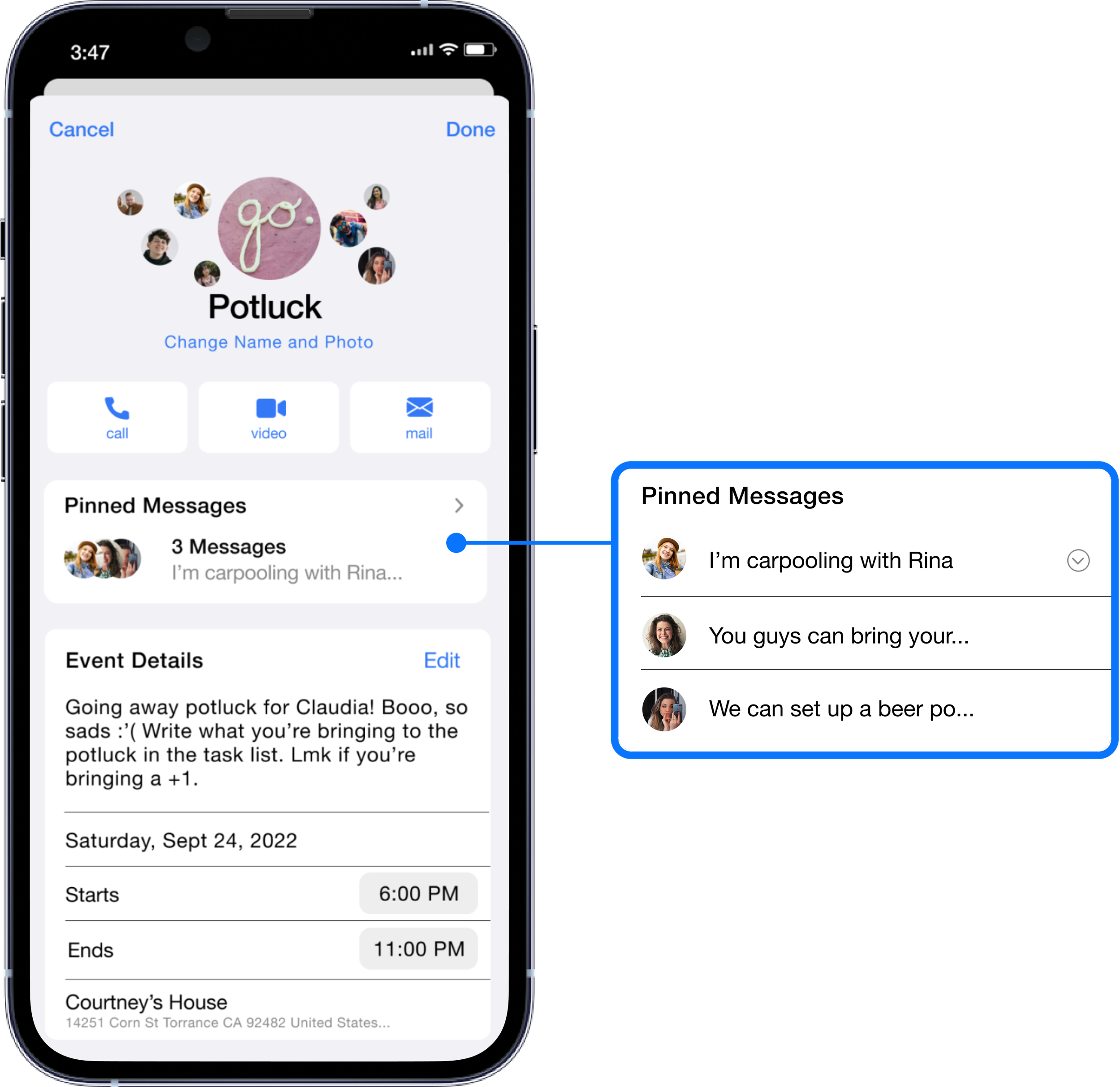
Pinned Messages is one of the planning tools that can be easily found and accessed
Pinned Messages
User Flow
Clicking the underline date mentioned in the chat
or Clicking into Group Info (setting)
Key Screens
Key screens I focused on were Create an Event and Planning Tools. From the research, users prefer planning tools that are familiar and easy to use. I’ve designed it to be intuitive so that it’s quick to learn the navigation and features.
Group Chat: 2 Entry Points
Group Chat
There are two entry points to the planning event feature:
Entry Point 1 - Group Info (group chat icon). Users are able to View All Events and Create an Event.
Entry Point 2 - Click the mentioned date (Sept 24) in the group chat (if a member mentions a date).
Entry Point 2: Mentioned Date
Entry Point 1: Group Info
Create Event Details - Add
Create Event Screen
Event: Potluck Screen
Potluck
After the Event Details, users will be able to view and access planning tools in the event:
Pinned Messages - Users lose important details in the conversation. Messages can now be saved by pinning
Voting Poll - voting is organized with a voting poll
Task List - displays tasks, who is assigned the task, and when it’s completed
Invite List - shows which users are attending, not attending, and have yet to respond
Calendar - user can add to their personal calendar
Alerts - users may set reminders to complete their tasks and alert them when the event is starting soon
Event Screen (top half)
Event Screen (bottom half)
Prototyping & Testing
Gathering User Insights
After creating key high fidelity screens, I conducted usability testing using GoogleMeet. I gathered 6 participants who regularly uses iMessage. Users were assigned tasks of creating an event, finding the new event they just created, and finding each planning feature.
Observe ease of the navigation
Observe where the users will go to Create Event
Test to see if users can easily find important event details
Test to see if users can find the planning tools
Discover inconsistencies in the feature including navigation errors or lack of clear content, labels, etc.
Objectives
Successes
All users successfully completed the task of creating an event. Usability rating 4.9 out of 5
After exploring the feature, they were quick and confident in knowing where everything was
Users were familiar on how to use the planning tools
Users mentioned that they could see themselves using this planning feature. They particularly liked the Voting Poll and Task Manager
Feedback from testing and design critique brought forward issues with my initial designs. To limit hesitation and confusion, I made the following changes:
Improvements
Narrowing Down the Entry Points to Create an Event
Before: 2 Entry Points
After: 1 Entry Point
A couple of the users took some time to think about where they could find Create an Event due to:
One user clicked on the app bar, but soon realized it would be found in Group Info and was able to find Create an Event
The users that created an event using the date pop-up were confused on where to find the event they just created. They went back to the date pop-up. They clicked Show in Calendar to find the event, but it wasn’t there
To eliminate the confusion, I decided to narrow it down to one point of access to Create an Event.
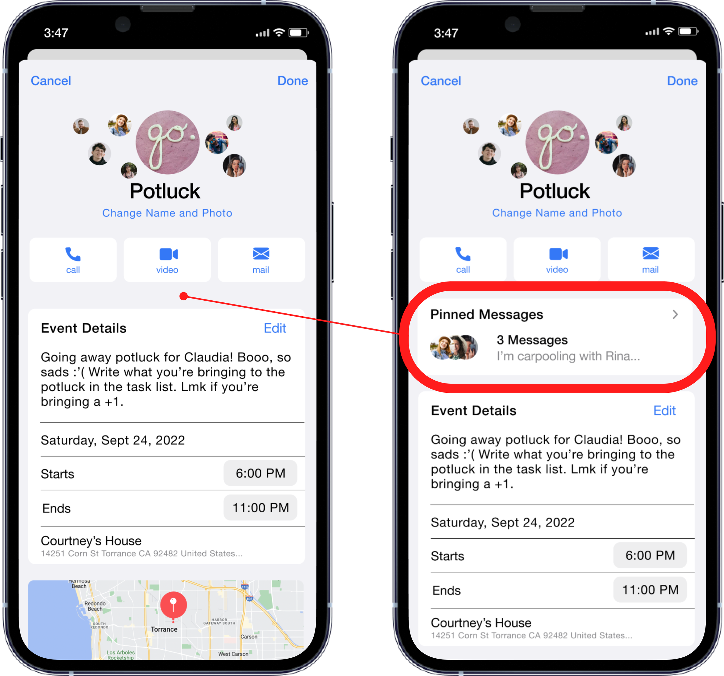
Relocating Pinned Messages
Before: Pinned Messages was found after Event Details
After: Pinned Messages moved to the top, before Event Details
Users expected Pinned Messages to be found right away, near the top of the screen. Before, it was located after Event Details. Users almost missed Pinned Messages by scrolled past it.
I made changes by moving Pinned Messages to the top so that users can easily access it instead of having to scroll down to find it. It’s intuitive for iMessage users to find Pinned Messages at the top and important details should be the first thing users see.
Final Thoughts
What I Have Learned
This project was good practice for exploring ideas to add onto an existing product. One of the challenges was that I had to fit this feature into iMessage’s existing UI which gave me the opportunity to further learn about Apple’s design patterns.
Integrating finance apps that tracks shared expenses
Everyone in the group chat will be able to add their availability to find common free dates
Integrating calendar apps other than Apple’s calendar
Creating more access to the event planning feature, such as– a desktop view option, creating event from the Apple calendar
Next Steps
See More of my work


